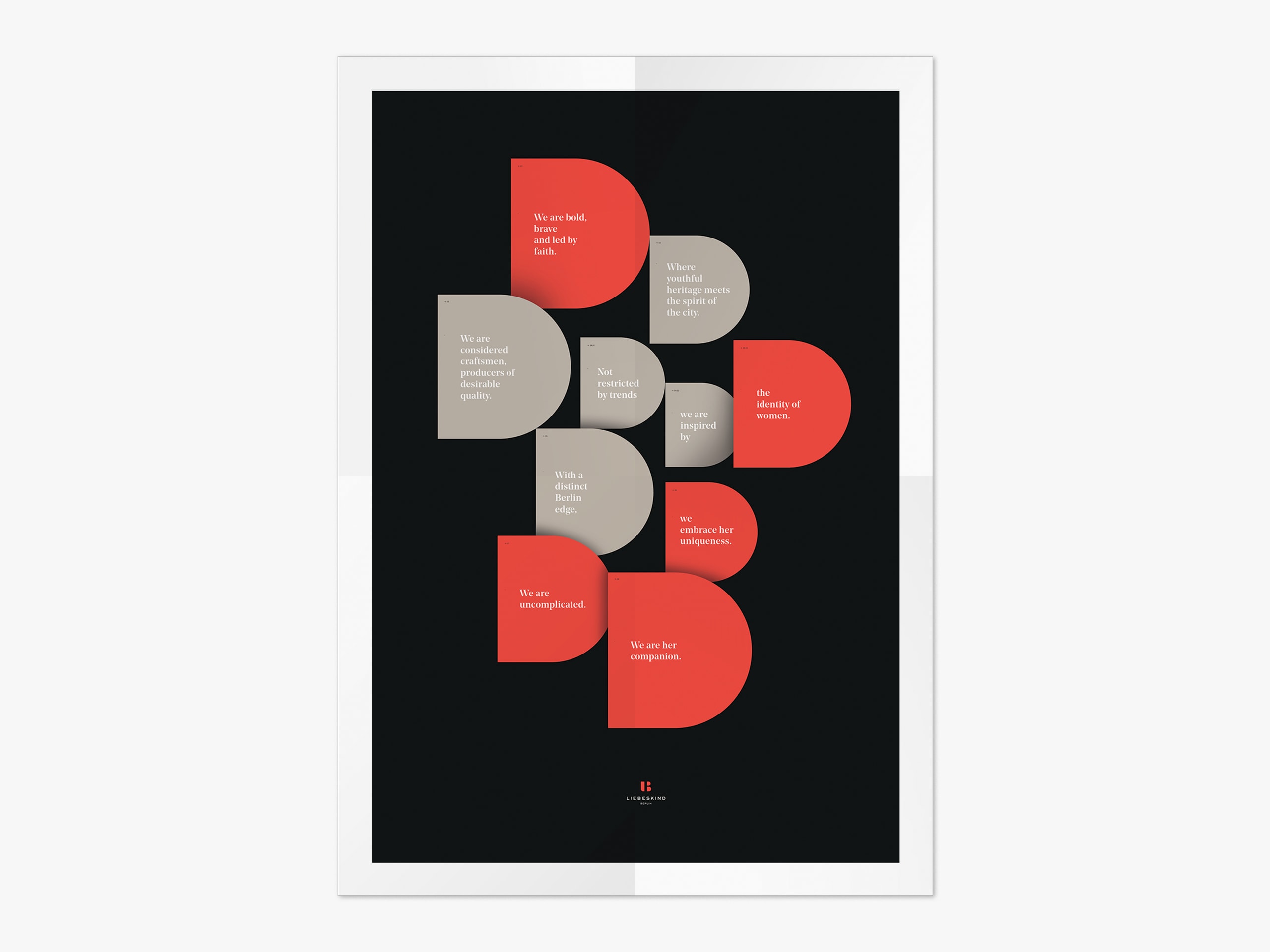
Liebeskind Berlin has stood for leather bags with urban attitude since 2003. Berlin as origin and compass. Internationally visible. Then the dynamic began to flatten. We accompanied the new leadership in identifying opportunities, sharpening the identity, and positioning the brand for its next stage of development.
Description We started with the business data and the brand core. Berlin as attitude. Bags as center. RTW and shoes organized, complexity reduced.
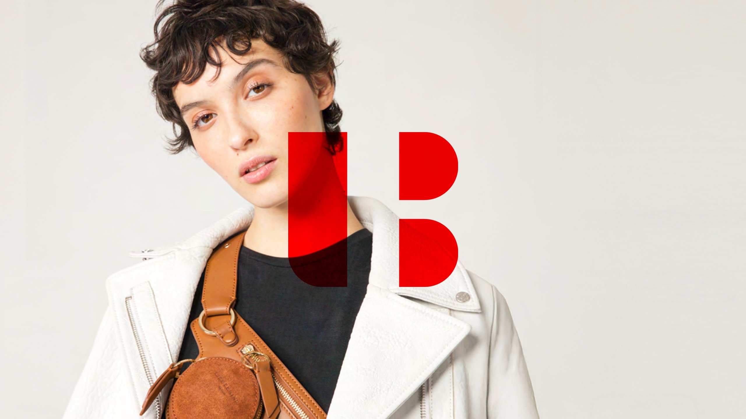
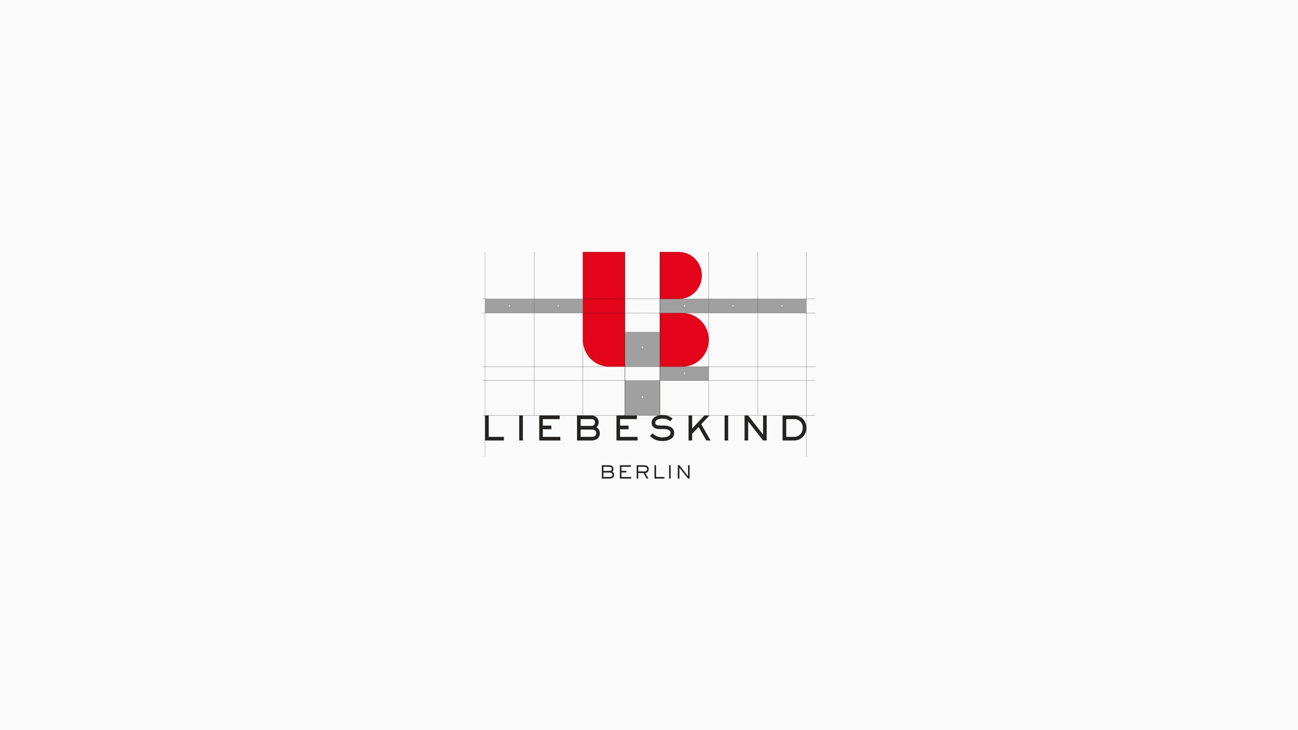
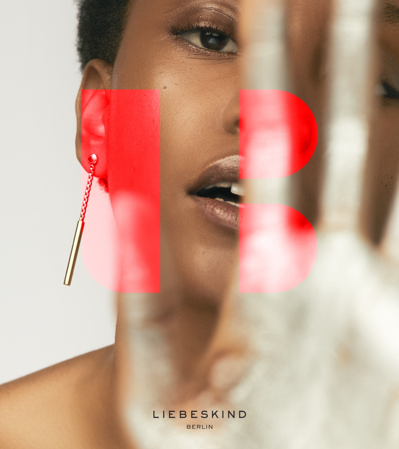
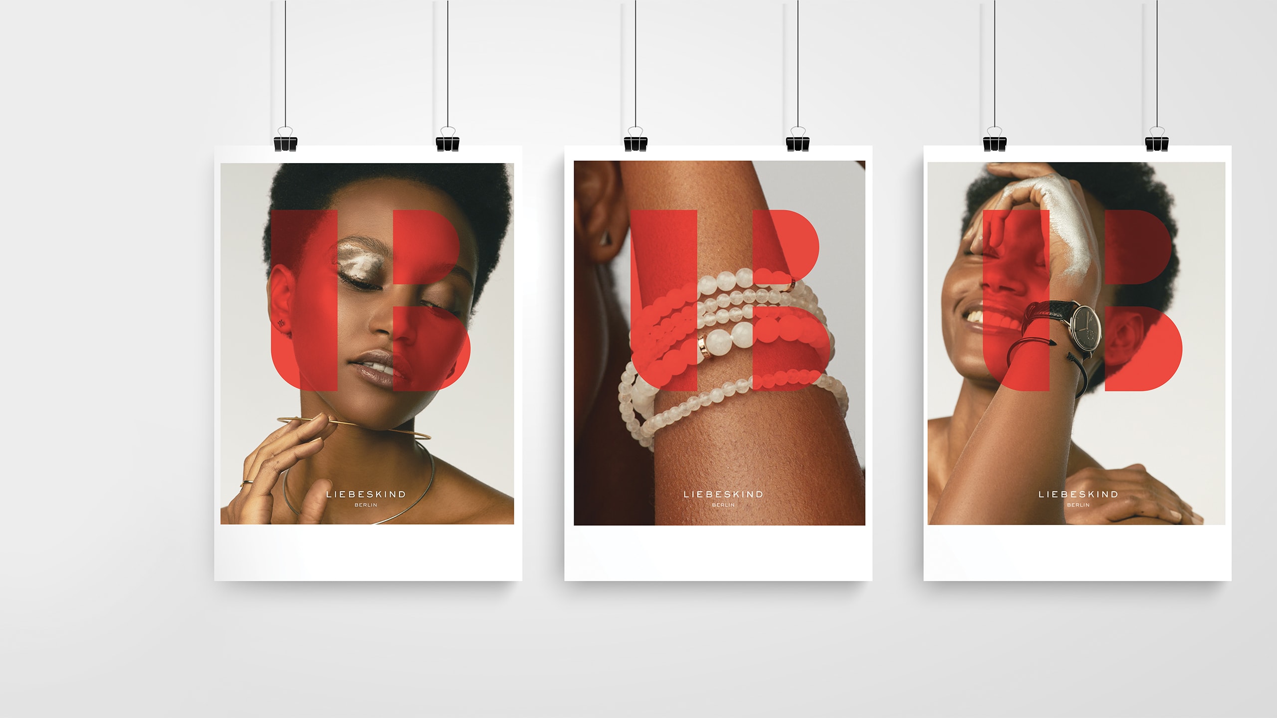
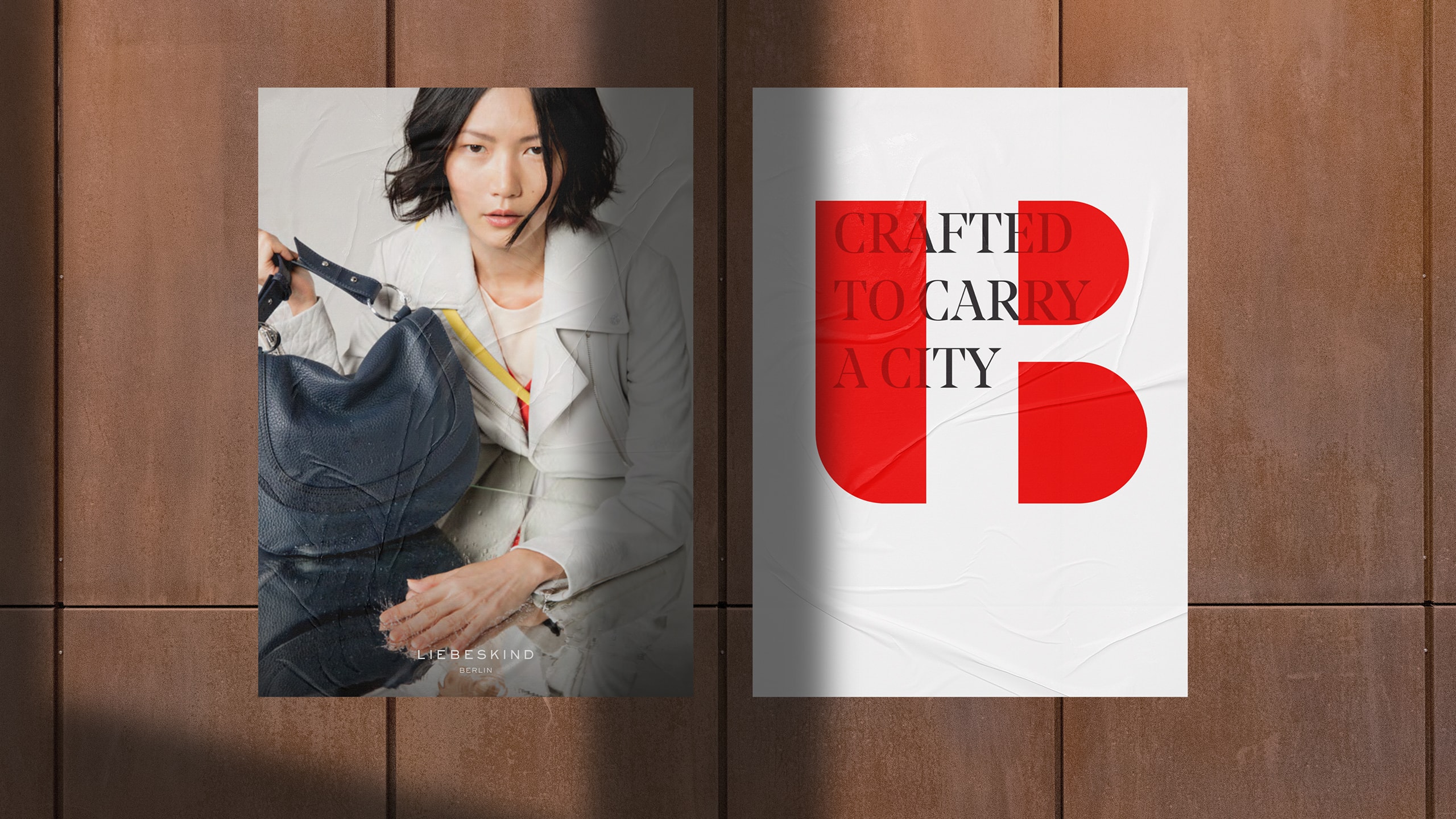
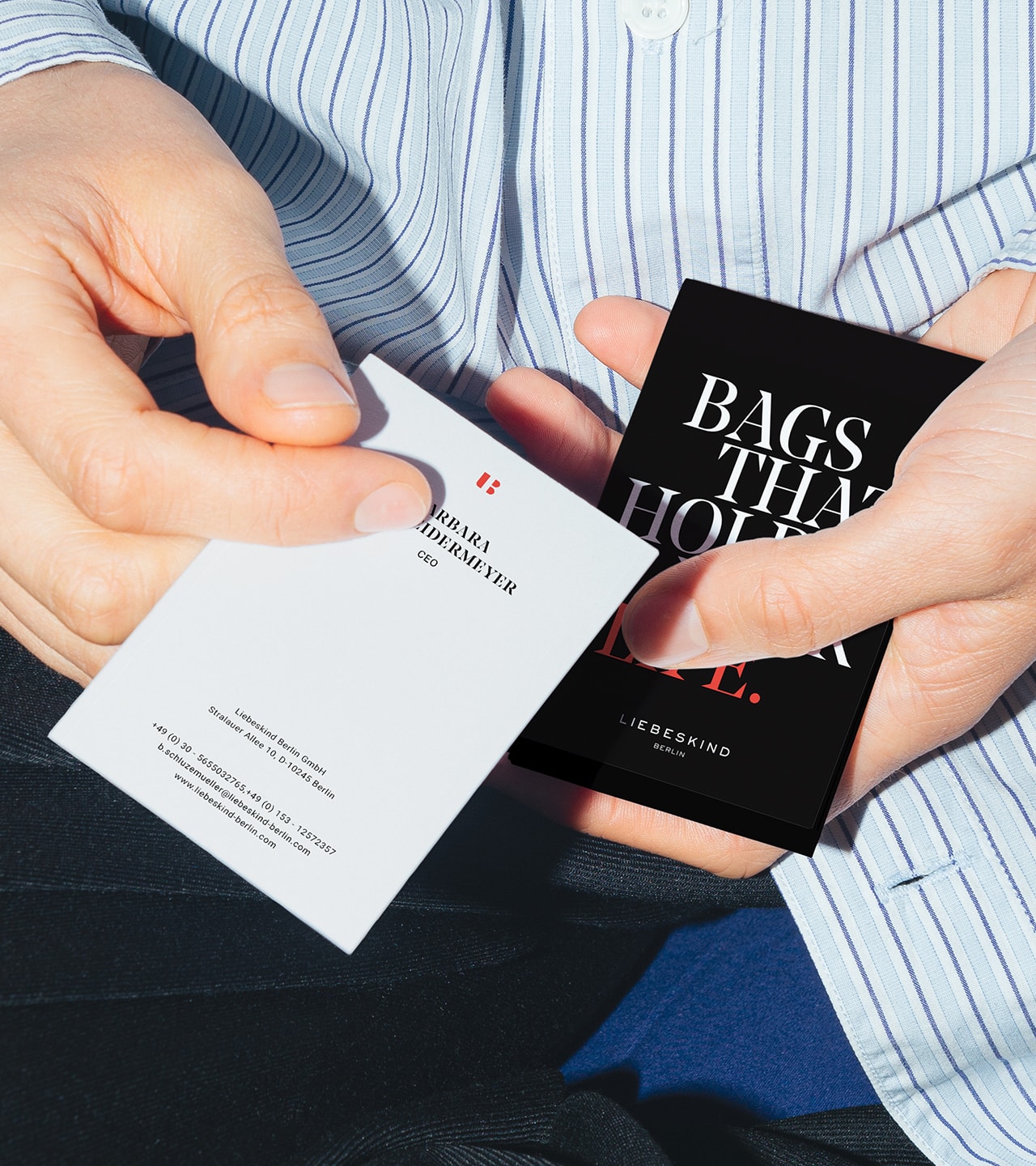
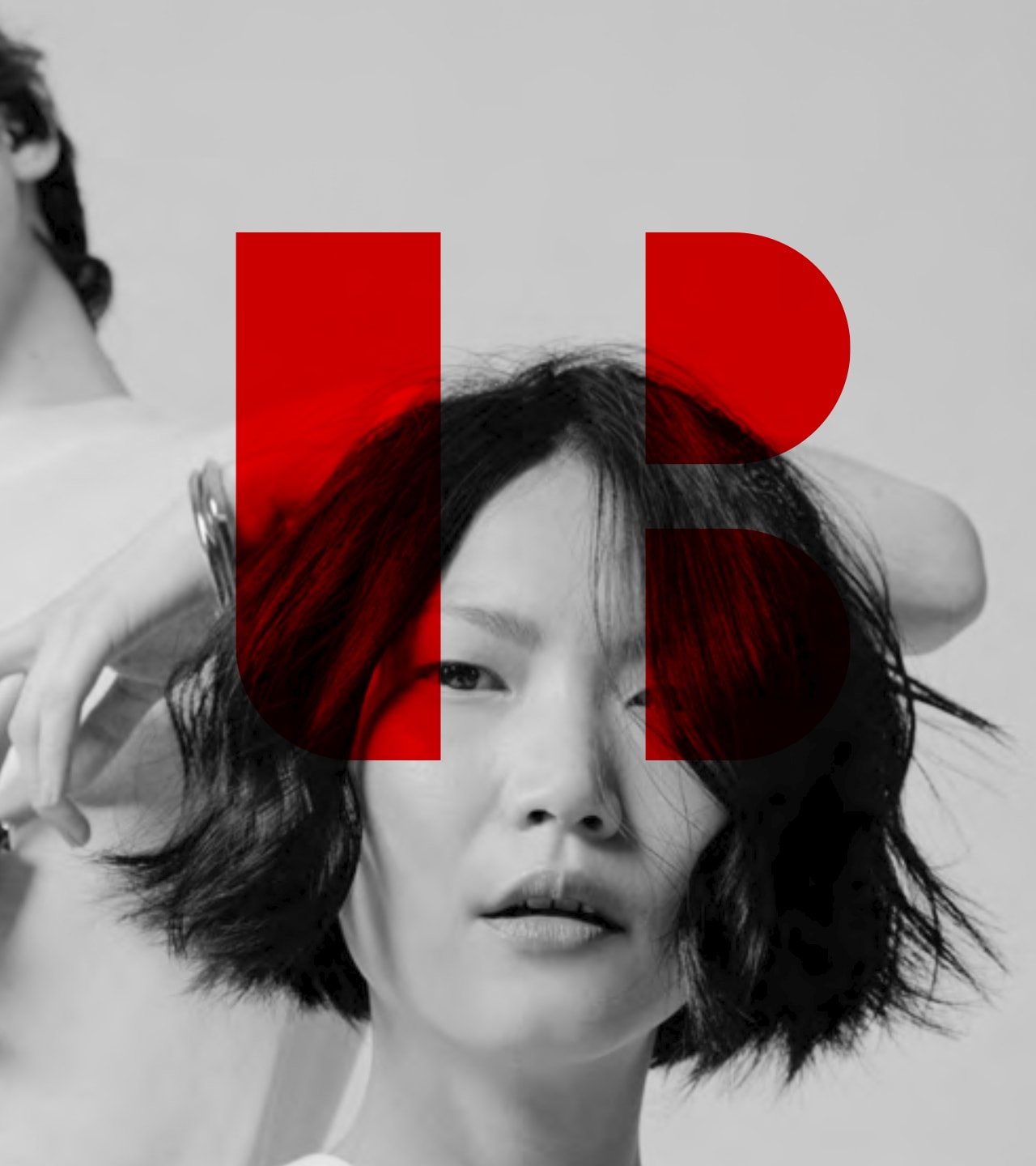
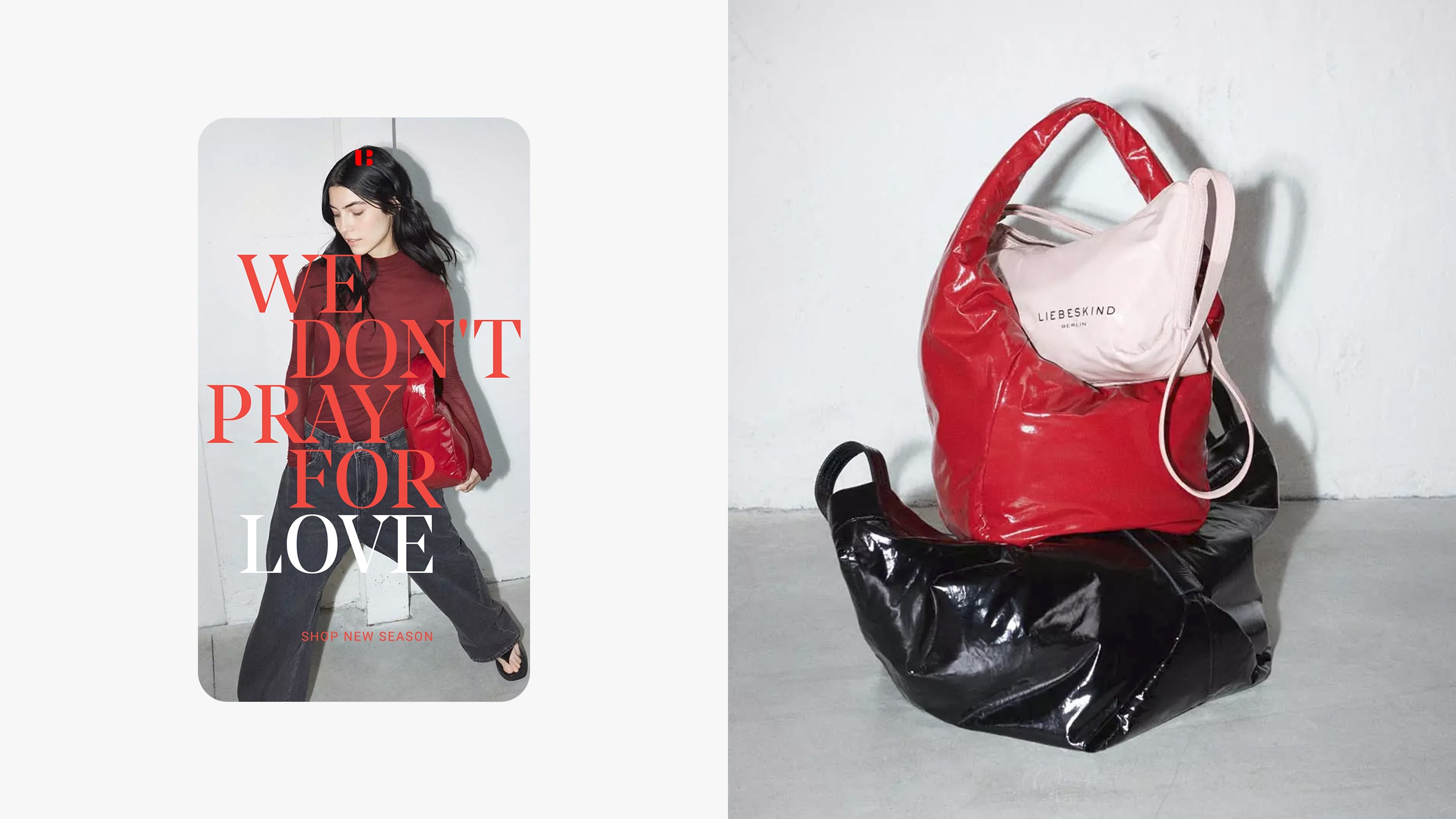
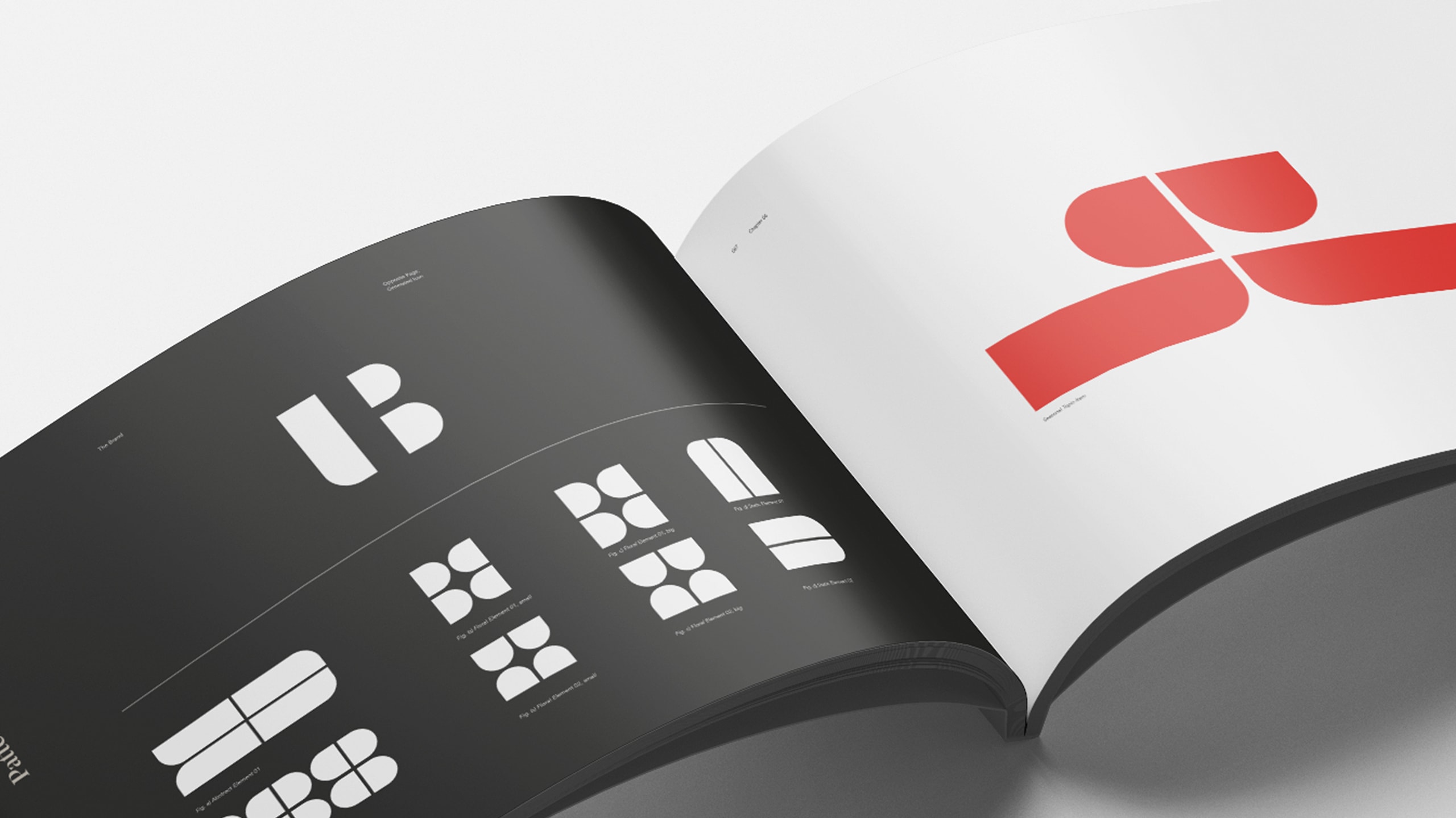
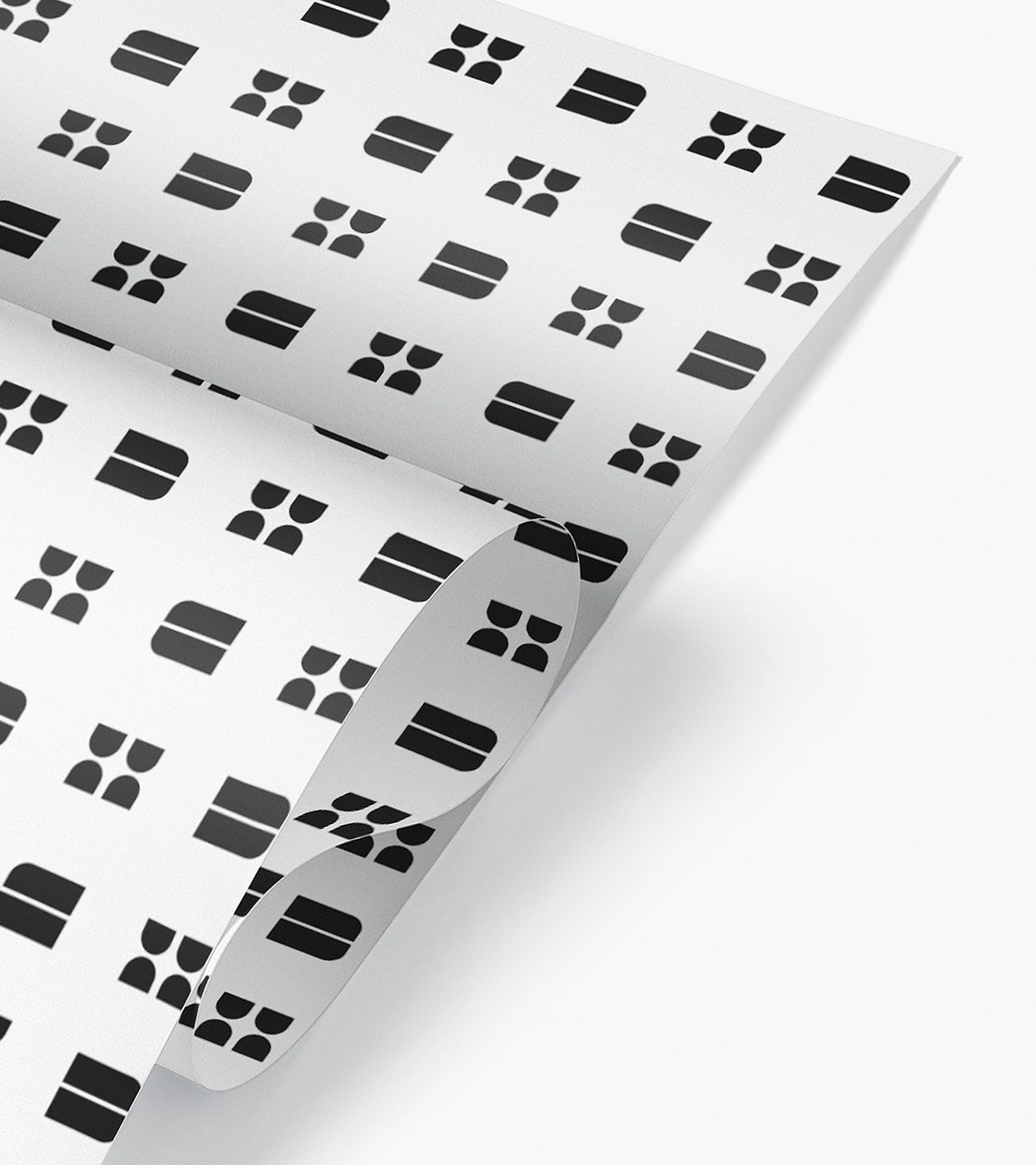
Growth logic redefined: omnichannel as bridge between store and digital. Priority on owned e-shop and social platforms. The new icon tells this attitude. L and B form a ligature. The punches become the mark. The invisible becomes visible. A symbol for what was already inside, honoring the team and their intrinsic drive.
Together with the leadership team, we reassessed distribution, wholesale, pricing, and markets. In parallel, we analyzed brand perception among customers and within the team. This created the basis for a brand framework uniting language, design, and applications. A system, not isolated cases. For campaigns, retail, digital.
The result: The portfolio is clear. International presence focused. Store network follows logic. The brand speaks cohesively and performs across all channels, measurably. The new system carries through the entire experience. Decisions accelerate. Growth becomes possible again because structure and tools clear the way.
Highlights FocusonCoreBusiness Strategic refocusing on bags as lead category, reducing complexity in RTW and shoes.
Digital-FirstGrowth E-shop redesign and social media playbook established digital as primary growth driver within omnichannel model.
Premium Positioning New pricing architecture and premium lines introduced to elevate relevance and brand value.
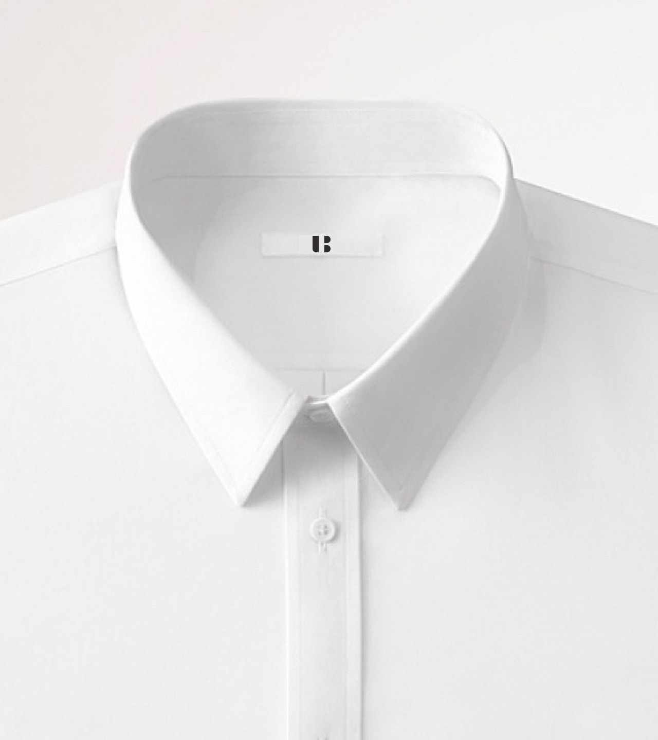
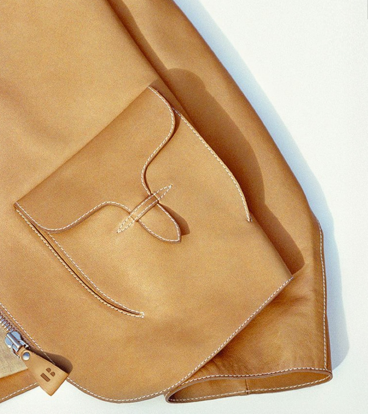
BrandIdentity Flexible brand toolbox, comprehensive brand standards, and distinctive symbol derived from wordmark developed as strong, unmistakable visual system.
team
Jasmin Jilka Christoph Grünberger Jasmin Phull Gary Cadogan Peter Stahmer Flo Renner Mario Jilka
Partner HML Modemarketing GIK
Read more
Visual System
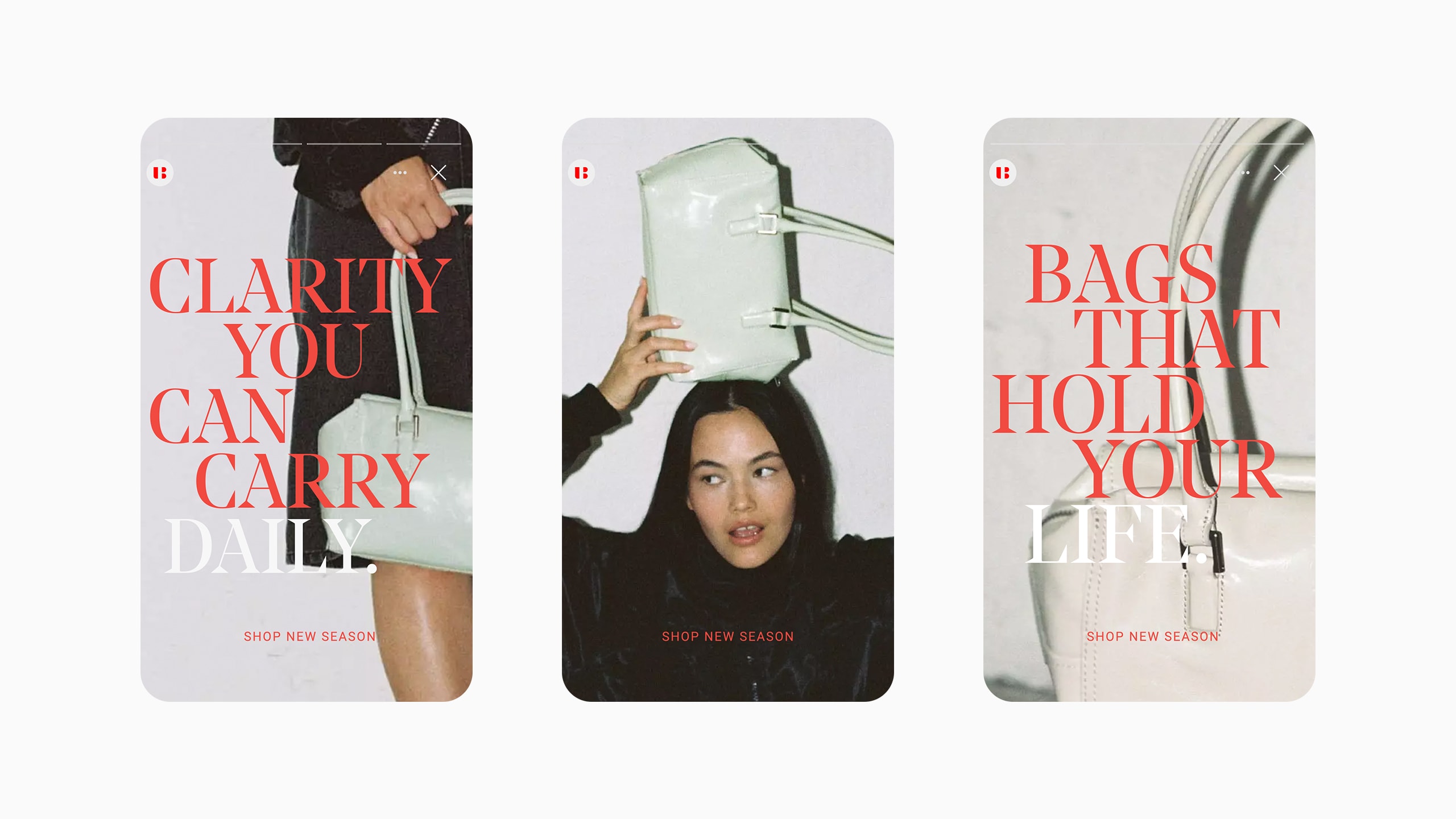
Typography, geometry, palette, and pattern work in the same rhythm. Brand voice and imagery support the attitude. This creates a modular toolkit, precisely guided and easy to play. A system that creates consistency and opens possibilities.
Experience Architecture
Berlin is origin and compass. Our stories lead through the city and into the shop. We reduce friction and increase focus. Fewer options, clearer paths. Products become scenes. The architecture is modular and grows with campaigns and capsules.
Social is the gateway to this world. Creators tell Berlin from their perspective. Live moments and pre-drops capture the city's rhythm. Curated landing pages hold the thread, from feed to checkout. Signals from social flow into merchandising. This creates a connected experience where attitude leads and technology supports.
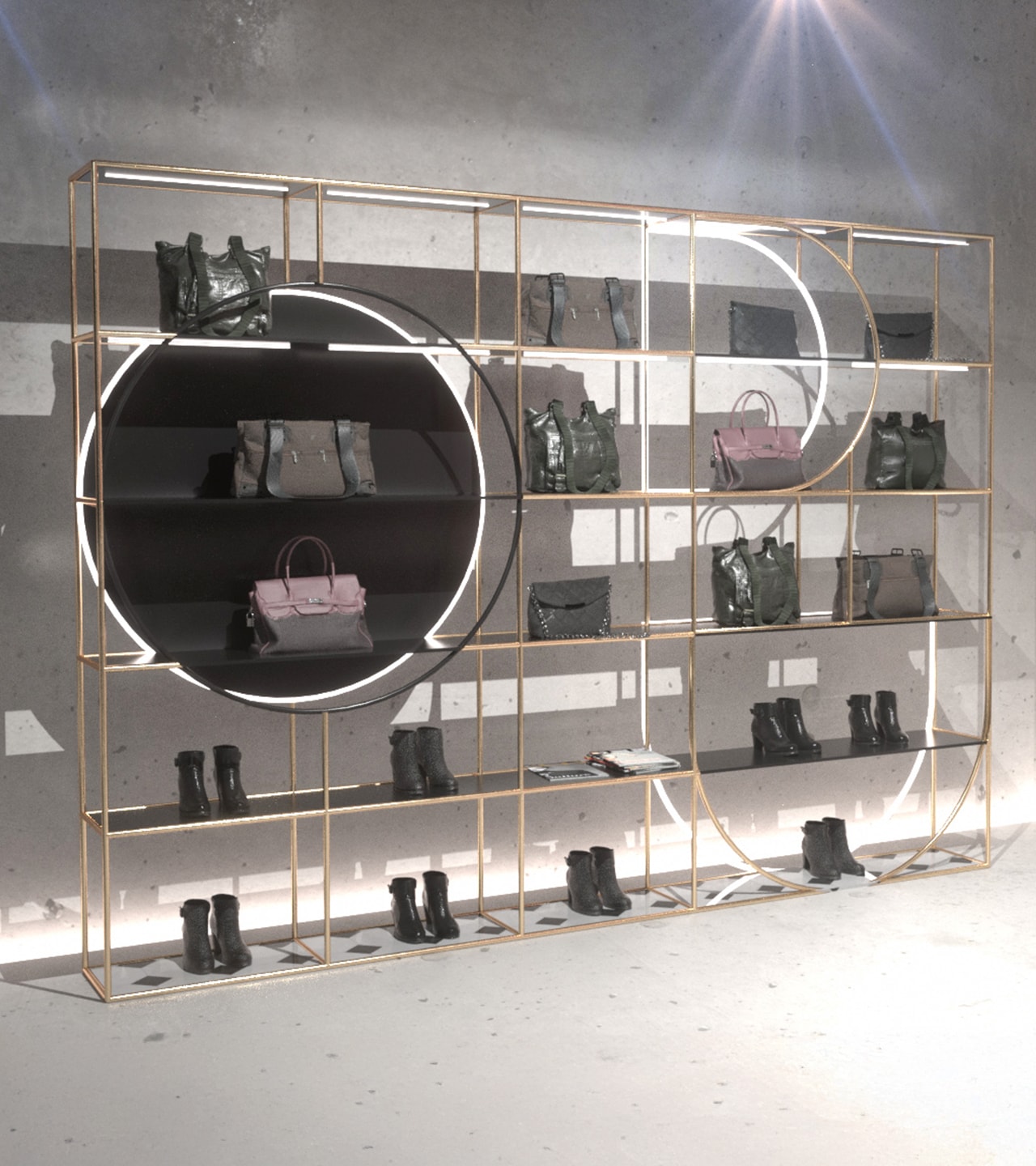
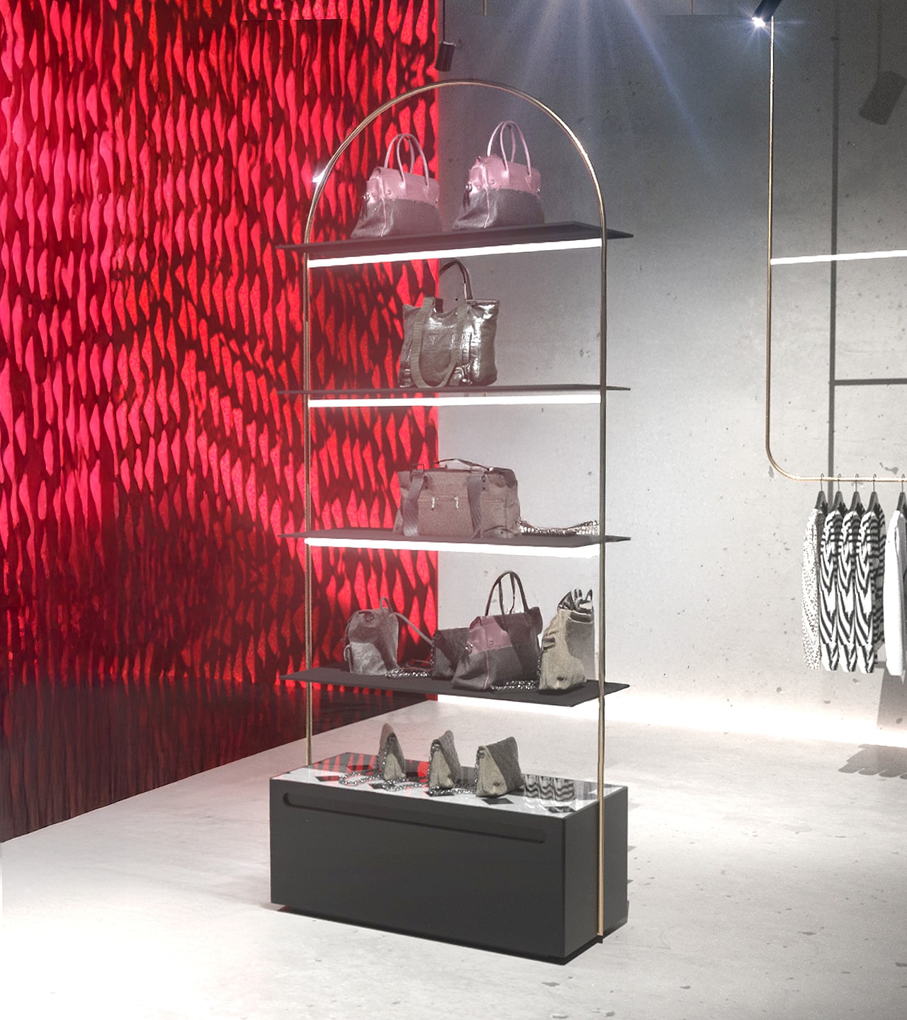
Retail Translation
From form to attitude. The negative spaces of the wordmark form the grammar for fixtures, gondolas, and wall systems. Color concept and typography guide signage and orientation. The modular set allows individual solutions without losing the line, from partner stores to monobrand.